
149 title images, one style: how I re-illustrated my blog in one evening as a batch job
Over the years everything got mixed up on my blog: my own photos, screenshots, AI images from three generations, sometimes realistic, sometimes watercolour, sometimes 3D. I wanted one consistent look. With my rules, an analysis of every old image and a small batch script for ArtCraft, every post now has its own title image in the same comic style. Before and after, the rules, the cost and the pitfalls.
🌐 Also available in: Deutsch · Français · Español · Italiano · Português · Nederlands · Polski
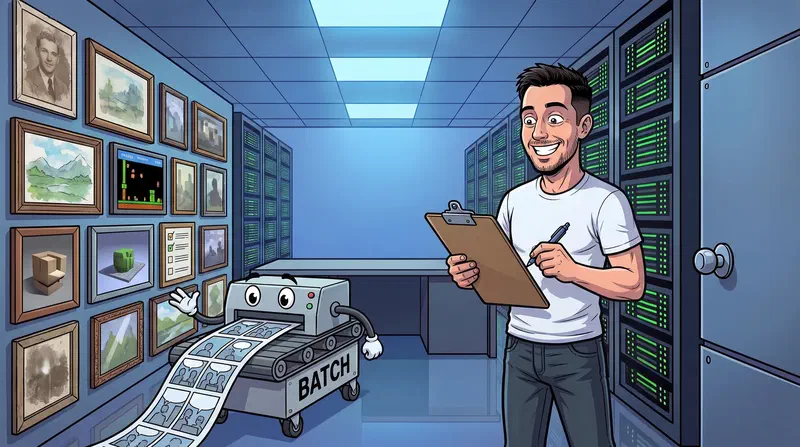
In short: My blog is now old enough for its title images to have mixed thoroughly: my own photos, screenshots, vendor images and AI images from several generations, sometimes almost photorealistic, sometimes watercolour, sometimes 3D. I wanted to unify that. Now every post has its own title image in the same comic style, with the same character and the same place. 142 images are new, 7 photos of my own hardware stayed. I used the same technique as for the Christmas video – ArtCraft, driven by Claude Code through an MCP server – only this time for images and as a batch.
Table of Contents
🖼️ Why: a blog that looked like a flea market
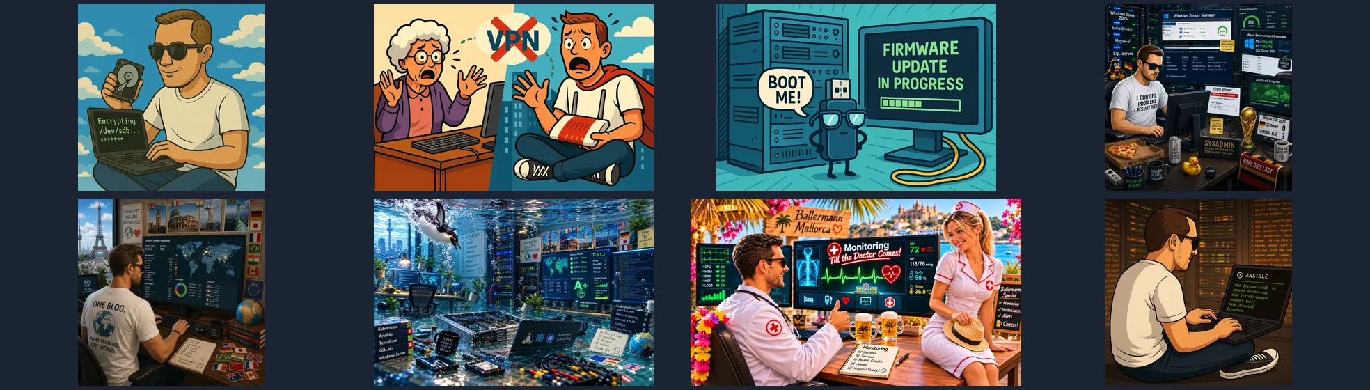
Anyone who has blogged for a while knows this. At first you take a photo of your desk or a screenshot. Then come the first AI images, each in whatever style the model liked at the time. Half a year later the next model can do more, and the images look different again. Every single post was fine, but on the overview page the blog looked thrown together.
This is a selection of how it looked before:
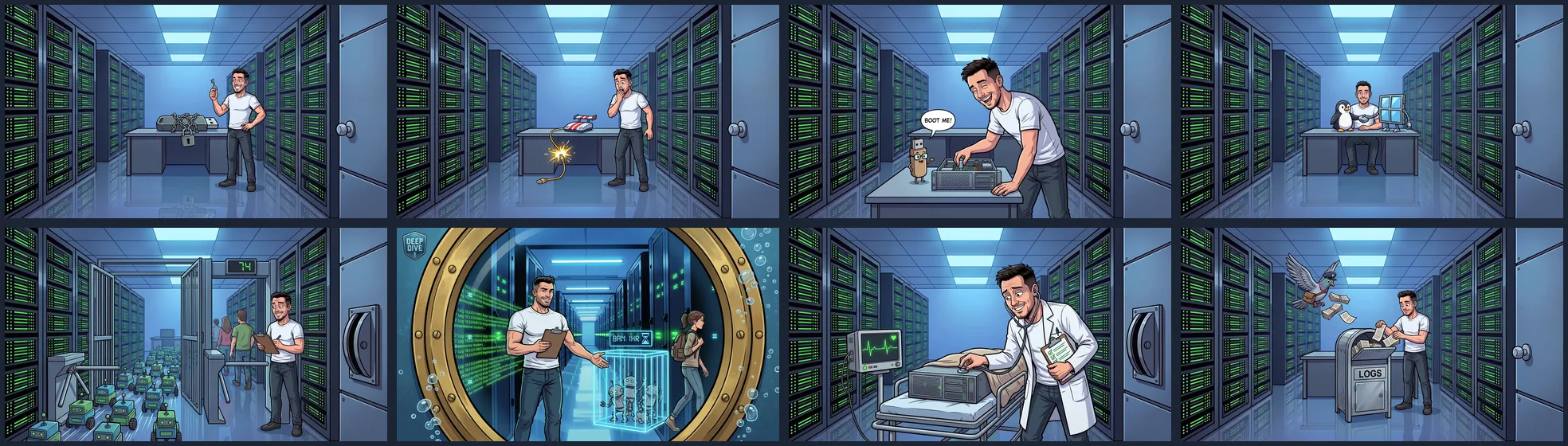
And this is how the same eight posts look now:
📋 My rules
Before a single image was made, there were three drafts for the style: an almost photorealistic one, a comic and one in the style of a 3D animated film. The realistic one was too close to a real photo of me, the 3D look too playful. The comic in the middle won. It became the standard:
- One character for the whole blog: a nerd, inspired by me but clearly drawn as a comic character – short dark hair, stubble, white T-shirt, jeans.
- One place: the data center corridor with blue light and green LEDs, a desk at the end of the corridor. When the nerd does something at a computer, he sits exactly there.
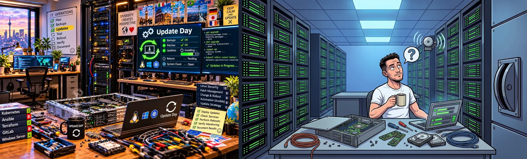
- People, a basement or an office in the old image → the standard scene in the data center.
- Disassembled hardware (as in “Update Day”) → the same desk, only now with lots of hardware on it.
- A robot in the old image → the robot stays the main character, but in the data center.
- Outdoor motifs → the meaning of the original stays, just in comic style.
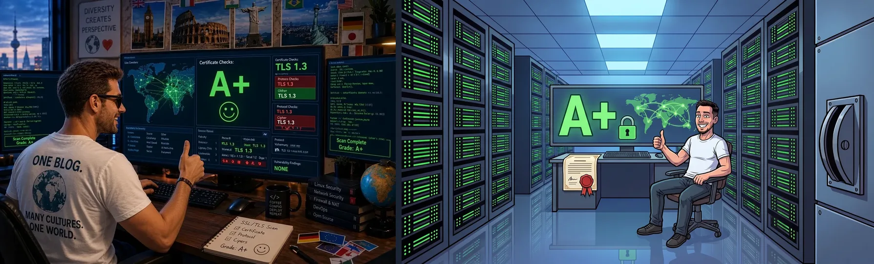
- Characteristic content stays: the SSL post still shows “A+” on the screen.
- Text in images only in English, at most one short word.
- No logos and no brands.
- Every post gets an image of its own. Series may share a recognition element: the Deep Dives look through a brass porthole, the Ansible tour has a map in the background.
- Special cases are settled separately: photos of my own hardware and other people’s works such as book covers.
Two examples of how the rules work:
🤖 The technique: like the Christmas video, only for images
For the Christmas video for the team I used ArtCraft, a subscription that gives access to several commercial image and video models. It is not driven through its interface but through an MCP server: Claude Code writes the prompts, uploads reference images and fetches the results. That is exactly what I did again here, only for images.
And images are much cheaper than video. One image with Nano Banana Pro at 2K costs 15 credits. A 4-second video clip was around 100 credits for the Christmas video. For the price of one short clip I get almost seven title images.
The image that always goes along as a reference is a scene from the standard: the nerd in the corridor, the desk at the end. That keeps the character, the place and the line work the same across all images, although each image is generated on its own.
⚙️ In the end it was a batch job
With almost 150 posts you do not click every image together by hand. The workflow was therefore a classic batch:
- Analysis of every old image. For every post Claude looked at the old image and noted what it shows, what the post is about and which idea the new image should carry. Along the way things turned up that had to go anyway: a book cover, a vendor image, a product photo with a company logo, a cut-out of a vehicle registration document.
- One prompt per post, all following the same skeleton: style, character, place, then only the scene. Everything goes into one JSON file.
- A small script submits all jobs and fetches the finished images as soon as they are ready. This happened in rounds: first the 5 newest posts as a test, then 20, 40, 68 and finally the rest. I worked my way from the newest post to the oldest. When the credits ran out, the process waited for the next top-up.
- A visual check of every image, conversion to WebP, a new alt text in all eight languages of the blog, build, link check, deploy.
In the end that was about 160 generated images, a few of them drafts and retries. At 15 credits per image that is roughly 2,400 credits.
🪤 Pitfalls
The lever that turned up everywhere. My first reference was the image for the cache post, with a big lever labelled “CACHE” on the wall. The model took it as a fixed part of the room and put it into images where it had no business. Generating them again would have cost credits each time. Instead I removed the lever locally and for free, with FLUX Kontext in ComfyUI on my AI PC. After that there was a new reference without the lever, and the problem was solved.

By the way, the lever belonged in one image only: in the cache post the cache is literally “switched”, there it is the joke. In all other images it made no sense.
That was not the end of it. Looking through the images I noticed: the lever was gone, but the empty mount – a black plate with a round recess – was still in the wall. It came in through a second reference that still had one. About 40 images are affected. The retouch again runs locally with FLUX Kontext on my AI PC, as a batch, without a single credit – it cost nothing but electricity. The PC needs about four and a half minutes per image; I will add the exact number of images and the total run time here once the batch is through. One trick: only the area that really changed goes back into the image. Everything else stays the original, pixel for pixel.
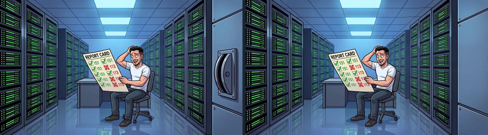

The lesson: pass only one clean template as reference. Whatever is in the reference, the model takes as a fixed part of the world. Three images keep their lever on purpose, by the way: the snail in the cache post, the “SECURE” switch in Defence in Depth and the switch the nerd pulls in the HTTP/3 post.
Vanished jobs that had not vanished at all. The session’s job list only shows the latest jobs. Older ones therefore looked as if they were gone, but they were finished and could be fetched directly through the job API.
Some words the filter does not like. Prompts with “intruder”, “attack” or “cage” sometimes simply did not come back. Phrased more kindly, they worked.
Special cases are better left for later. Photos of my own hardware – the rack, the NUC, the ThinkPad, the open HP server – are real photos from my homelab and they stay. Other people’s works were replaced: the book cover, the vendor image of the firewall box and the product photo with a logo.
📝 And the texts?
If the images are made consistent, what about the texts? An analysis of all 150 German posts showed four phases: short, matter-of-fact guides in spring 2025 with about 420 words, then looser texts with more humour, stories with an italic tagline and finally reportages and series with about 1,900 words – four times as long as at the start. Already consistent were the informal address, the first-person view from the homelab and the emojis in front of the subheadings. Inconsistent was the skeleton: a summary at the beginning was missing in 143 of 150 posts, and the ending was called “Conclusion”, “The lessons”, “The moral of the story” – or was missing altogether.
My rule: tone and length stay, the development is part of the blog. Only the skeleton is aligned. Now every post starts with an “In short” of two to four sentences and ends with a "🎯 Conclusion". Both are written from the existing text, in the tone of the respective post, without new claims. 144 summaries and 51 conclusions are new, and in 99 posts only the existing closing heading was made consistent – all in all eight languages, again as a batch, and as with the images with a small style guide that new posts follow from now on.
🎢 Header and logo – or: my homelab’s corporate design
If everything becomes consistent, then properly. Every decent company has a corporate design with a style guide, a logo and a brand ambassador. Now my homelab has one too: the style guide is a Markdown file on the NAS, and the brand ambassador is the guy riding a roller coaster on a network cable. He now sits in the header at the top right instead of the Linux penguin. A version with the address www.apt-upgrade.me is my new blog logo and profile picture. The marketing department (me) and the design department (Claude and ArtCraft) agreed in a single session – not every corporation manages that. 😄
🎯 Conclusion
- 149 posts, 142 new title images, 7 of my own photos kept, alt texts in eight languages.
- One evening for the actual conversion. Most of the work went into the rules and the analysis of the old images beforehand.
- A batch instead of handwork: first rules and analysis, then prompts into one file, a script submits and collects.
- The rules are fixed now. New posts get their title image in the new style right away.
What I like best: anyone scrolling through the overview now sees one blog, not a collection from a year and a half.